plot_regressions
Summary
plot_regressions draws scatter plots with fitted regression lines for one
x column against one y column. It is registered as regressions.
Use it to inspect the data behind a selected relationship, either as one plot per group or as a combined overlay.
Example figure
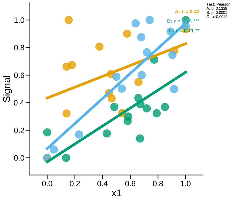
x1 vs Signal regression with the three groups overlaid. Rendered from the synthetic example dataset.
Signature
plot_regressions(experiment, x, y, by='conditions', factor=None, test='pearsonr', normalize_x=True, normalize_y=True, specificity=None, filter_by=None, roi=None, save=True, combine=False, split_by=None, x_range=None, y_range=None, xmin=None, xmax=None, ymin=None, ymax=None, clip_fit_line=True, share_axes=True, margin=0.1, auto_style=True, style_cycle=None, conditions=None, condition_col='Condition', factor_cols=None, animal_col='AnimalName', group_list=None, groups=None, group_col=None, group_cols=None, subject_col=None, dataframe_kwargs=None)
Input Object Types
| Object type | Accepted? | Notes |
|---|---|---|
Batch |
Yes | Main supported input. |
Experiment |
Yes | Works with .summary, .condition_list, and figure paths. |
MiniExperiment |
Yes | Works for summary-style data. |
pandas.DataFrame |
Yes | Wrapped internally; pass group_col and subject_col when needed. |
Parameters
| Parameter | Type | Default | Meaning |
|---|---|---|---|
experiment |
Batch, experiment-like object, or DataFrame |
required | Data source containing a summary table. |
x, y |
string or sequence | required | Columns to plot. If either is a list, PyFLASH runs all requested combinations. |
by / split_by |
string | 'conditions' |
Plot by conditions, by "all", or by a factor mode. |
factor |
string or None |
None |
Explicit factor column for grouping. |
test |
string | 'pearsonr' |
Correlation annotation method: Pearson, Spearman, Kendall, or aliases p, s, k. |
normalize_x, normalize_y |
bool, tuple, or string | True, True |
True min-max normalizes to 0-1; False keeps native units; (min, max) maps to a range; "Z-score" standardizes. |
combine |
bool | False |
Overlay groups on one plot instead of making separate figures. |
x_range, y_range, xmin, xmax, ymin, ymax |
numeric bounds | None |
Manual axis limits. Range tuples and individual bounds are merged. |
share_axes |
bool | True |
Share axis limits across queued sibling plots when a column repeats. |
margin |
float | 0.1 |
Add breathing room around points unless the relevant bound is pinned. Use 0 to disable. |
clip_fit_line |
bool | True |
Trim the fitted line to the active axis limits. |
filter_by / specificity |
mapping, tuple, list, or None |
None |
Row filter or filter queue. |
roi |
string, list, or None |
None |
Select one ROI summary or run an ROI queue. |
auto_style, style_cycle |
bool/list | True, None |
Use condition styles to distinguish same-color crossed groups. |
save |
bool | True |
Write SVG figures to disk. |
Returns
| Return value | Type | Meaning |
|---|---|---|
result |
dict |
Plot-run output keyed by group, queued (x, y) pair, ROI, or filter item depending on the call. |
leaf result |
dict |
Contains regression, r, p, and group for each rendered group. |
When combine=True, the same axes receives multiple group fits and the
teardown writes or closes the combined figure after the final group.
Saved Outputs
With save=True, PyFLASH writes SVG files below the input object's figure
folder in Regressions/. Separate figures are named like:
Combined figures are named like:
Filter, factor, and ROI suffixes are included when those options are active.
Examples
Minimal preview:
from PyFLASH.plotting import plot_regressions

fits = plot_regressions(
    batch,
    x="Age",
    y="GFAP_Count",
    normalize_x=False,
    normalize_y=False,
    save=False,
)
Combined overlay by diagnosis:
fits = plot_regressions(
    df,
    x="Age",
    y="Iba1_Count",
    group_col="Diagnosis",
    subject_col="AnimalName",
    split_by="Diagnosis",
    combine=True,
    test="spearman",
    save=False,
)
Queue several Y columns and inspect results:
queued = plot_regressions(
    batch,
    x="Age",
    y=["GFAP_Count", "Iba1_Count"],
    normalize_x=False,
    normalize_y=False,
    save=False,
)

for (x_col, y_col), result in queued.items():
    print(x_col, y_col, result)
Notes
The function coerces both plotted columns to numeric values and drops incomplete
pairs before fitting. If a group has fewer than two complete pairs, it draws no
fit line and returns r=nan, p=nan for that group.
The plotted p-value annotation is from the selected correlation method, not a
full linear-model pipeline. For adjusted models, use linear_model
or plot_multivariable_regression_matrix.
This registry entry is describe-layer covered: when PyFLASH.report is
active, each group fit emits a structured correlation record.